◼
Design system
One system. Every new page.
Open the agent chat, type /design-system and describe the page you need. The agent builds it from the styles, components and section grammar on this page.
01 Type
Heading / H1
Page titles. 60 / 1.2, h1.
Flexible office solutions designed around you.
Heading / H2
Section titles. 44 / 1.3, h2.
This is what Monday morning should feel like.
Heading / H3
Large card titles and numbers. 36 / 1.3, h3.
Private offices
Heading / H4
Card titles. 26 / 1.3.
Meeting rooms by the hour
Heading / H5
Small titles, names. 24 / 1.3.
Berlin Mitte
Heading / H6
Titles inside lists and accordions. 20 / 1.3.
Can I bring my team for a day?
Body / M
Running text and leads. 18 / 1.3, light, Text / Muted.
Desks, private offices and meeting rooms in three cities, with one membership that works in all of them.
Label / S
Badges, tags, navigation, buttons. 14, uppercase.
Coworking
Body / S
Captions, meta, notes on the right. 14 / 1.3, light, right aligned.
Open Mon to Fri, 7:00 to 22:00
02 Colour
Neutral / White
#FFFFFF
Section cards, navigation, text on photos.
Neutral / Light
#F2F2F2
Page background behind the white cards, light tiles.
Neutral / Black
#3D3737
Headings, labels, primary buttons, the footer.
Text / Muted
#7A7474
Running text and captions.
Border / Subtle
Black 30%
Dividers, card outlines, the hero overlay.
Neutral / Transparent
Transparent
Button and navigation variants without a fill.
03 Photos

01
Photographs of real workspaces in daylight: desks, lounges, meeting rooms, people at work. Warm, calm, no neon, no renders.
02
Full-bleed photos sit between the white cards (the hero, the parallax sections). Inside cards photos live in Card / Space, Card / Location and Card / Blog.
03
A dark overlay in Border / Subtle goes over the hero photo so white text stays readable.
04
Every photo layer has alt text that says what the space is and what is happening in it.
05
New pages reuse the photographs in the project or files the user supplies. Ask instead of sourcing.
04 Components
Button / Primary
The call to action: Primary with arrow, Secondary outline, Primary No Arrow. Hover inverts the fill, the size never changes.
Button / Submit
Form submit only. The form switches Default, Loading, Success and Error itself.
Navigation / Link, Navigation / Logo, Button / Icon Link, Button / Icon, Button / Icon Button
The pieces of Navigation / Nav and Section / Footer in the layout templates. Icon and Icon Button have White, Black and Light Gray variants for each background.

Badge / Label, Badge / Tag
Badge / Label opens a section (the small uppercase pill above a title). Badge / Tag marks a space type or an article category; White on photos.
◼
From private
Keycard access
Card / Visual, Card / Benefit, Card / Testimonial, Card / Team, Card / Timeline, Card / Detail
Cards with texts set on the instance: a visual tile, a benefit, a quote, a person, a milestone, a detail of a space. Desktop and Phone variants where they exist.
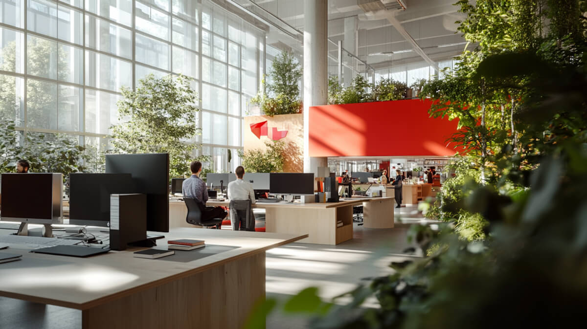



Card / Space, Card / Location, Card / Blog, Card / Value
Cards bound to the CMS: Spaces, Locations and Blog. Card / Space has a Horizontal variant for lists; Card / Value carries the values on About Us.
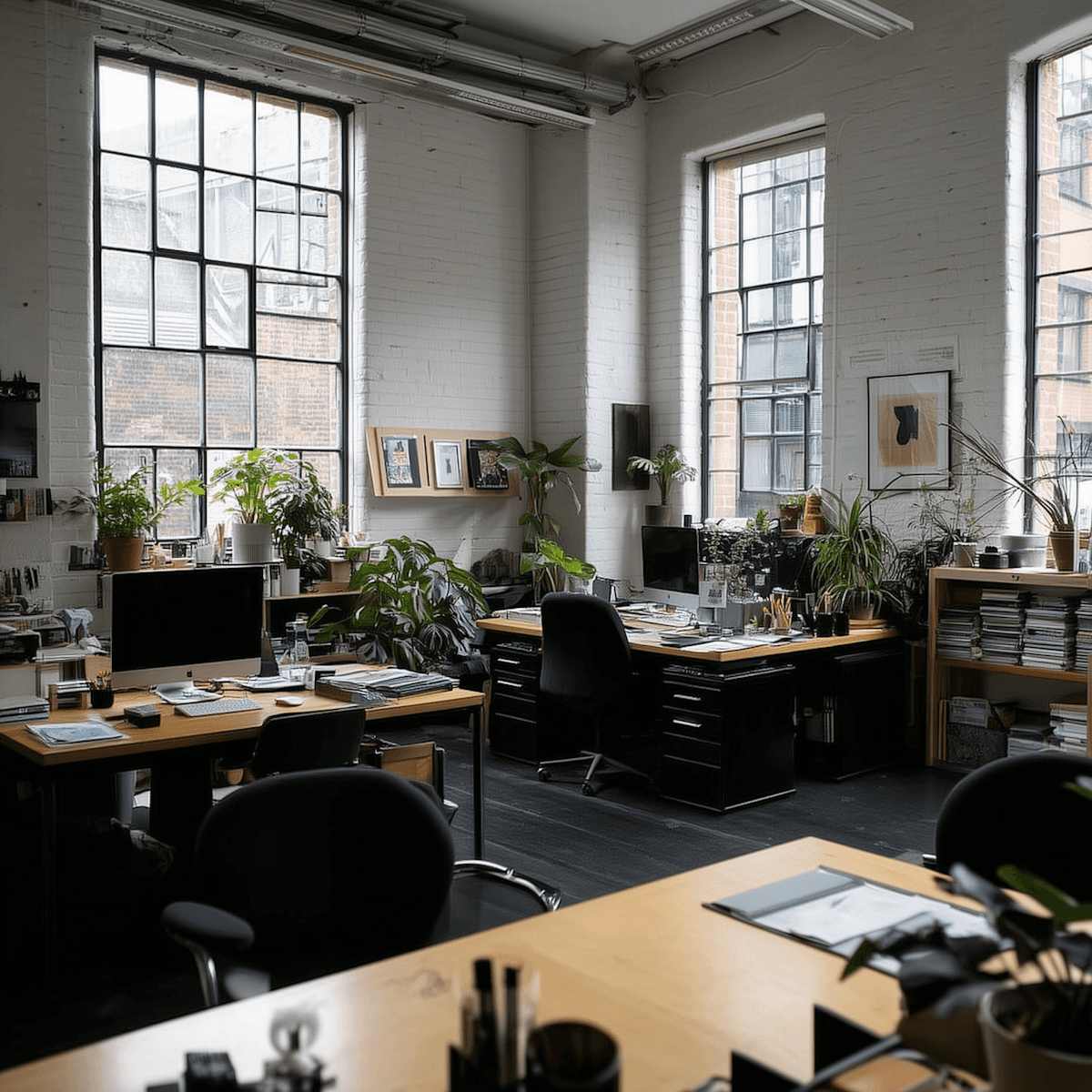

Section / FAQ, List / FAQ Accordion
The questions block: Section / FAQ switches which accordion is open (Open 1 to Open 6); List / FAQ Accordion is one question with Open and Closed.
How quickly can I move in?
Same day in most cases. Once your membership is confirmed, you'll receive access credentials and can start using the space immediately. No waiting, no setup time.
How quickly can I move in?
Same day in most cases. Once your membership is confirmed, you'll receive access credentials and can start using the space immediately. No waiting, no setup time.
Is there a long-term contract?
All our memberships are month-to-month with a short notice period. You're free to stay as long as you need and leave when it suits you — no penalties, no fine print.
What's included in the price?
verything you need to work — fast WiFi, access to shared spaces, coffee and tea, printing, cleaning, and on-site support. Meeting rooms are bookable separately or included depending on your plan.
Can I bring clients or guests?
Absolutely. All our spaces are client-ready. You can bring guests at any time — just let reception know in advance if you're expecting a larger group.
Can I use all locations or just one?
Depending on your membership, you can access all locations across the network — not just the one you signed up at. Check your plan details or ask our team.
Can I register my company at your address?
Yes. A virtual office address is available as an add-on or included in selected plans. Your mail and parcels will be handled by our reception team.
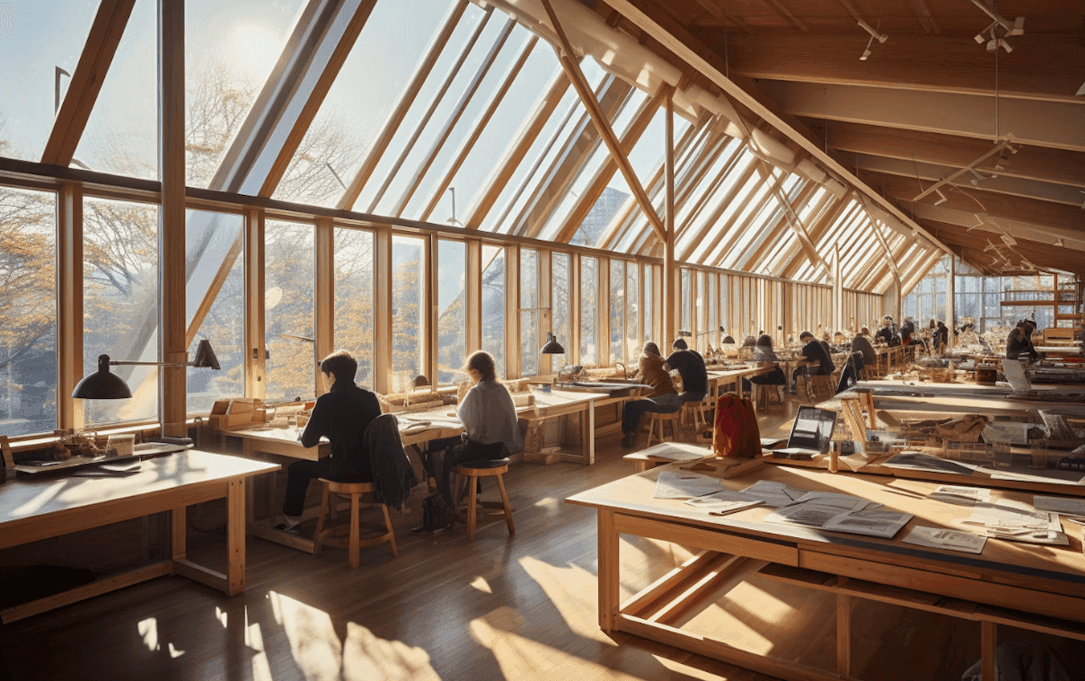
Navigation / Nav, Section / Footer, Navigation / Template Badges
Navigation and footer come from the layout templates Site / Hero Pages (Home, Location Detail, 404, with the badges) and Site / Inner Pages (all other pages). Never place them on a page.
05 Section grammar
Light frame, white cards
Main holds a Container filled with Neutral / Light, padding 90 (40 on tablet, 20 on phone). Inside it, each section is a white card, max width 1400, padding 40 at the sides.
Cards touch
Section cards stack with no gap; the first has padding 40 on top, the next ones 90, so the white column reads as one sheet with 90 px between sections.
Section head
Badge / Label, then Heading / H2, then a Body / M lead at max width 560. Head and content are separated by the card’s gap of 90.
Photo breaks
Between white cards a full-bleed photo section (Image Parallax, 80 or 100 vh) with one Heading / H2 over it. Never two photo breaks in a row.
Spacing
5, 10, 20, 40, 90. Card padding 40, gaps 20 between cards in a row, 40 between rows, 90 between blocks. Radius 0.
Lists
Spaces, Locations and Blog are collection lists of their cards, two or three per row on desktop, one on phone. Same number of items per row across the page.